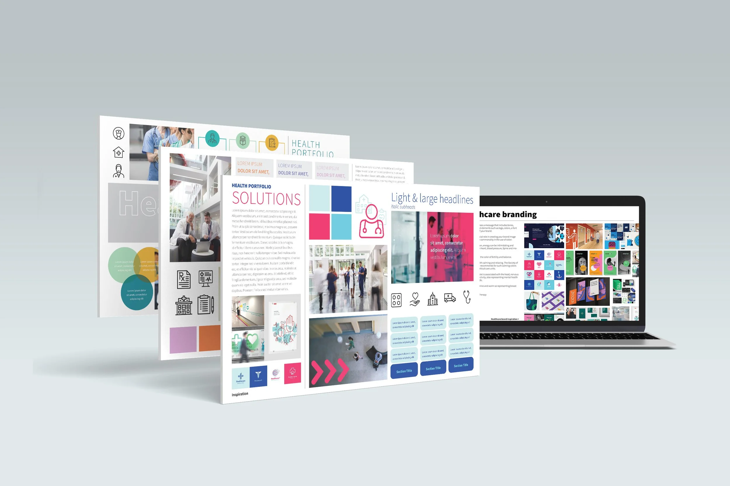
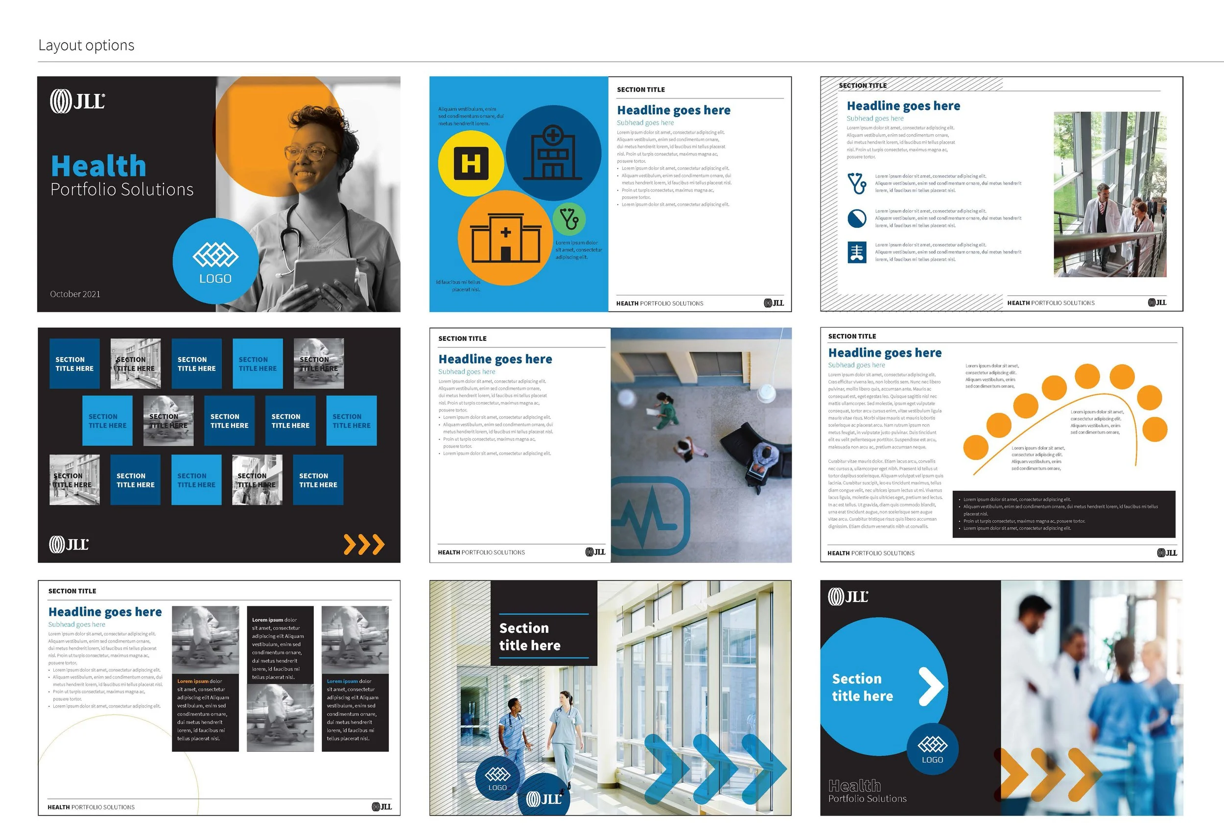
Healthcare Brand Identity
One of our highest revenue teams requested an updated look and feel that spoke to their client niche, but also kept them close to the corporate branding of the company. After researching the landscape of healthcare design in the market, we decided to lean into colors that better represent their client base while keeping in line with the corporate brand via typeface choice, photography, and icon style. The full identity included colors, graphic elements, specific icons, a photography gallery, and a presentation deck baseline.
Brand | Identity | Layout